Last updated: October 21, 2026
Key Takeaways
- A mixed-pattern patio usually works best with one main field and a smaller accent or border.
- A transition band, seam line, or accent panel can make the change feel planned rather than random.
- Use zoning when the patio has more than one function, and match the pattern change to the use change.
- Keep repeat alignment set from the first chalk line; once it drifts, it is easy to notice.
A mixed pattern patio works when each pattern has a job: one anchors the main field, one marks a border or dining zone, and the transition between them looks intentional instead of patched together. How to Combine Multiple Stamp Patterns on One Patio is about layout first, because the actual design problem is where each pattern belongs. The practical guide below covers mixed pattern patio design, not a catalog of pattern options. Quick answer: one dominant pattern plus one supporting pattern is the safest starting point.
Start with one pattern as the anchor and give the others a job
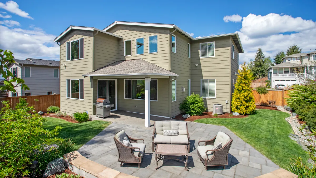
A mixed pattern patio usually starts with a dominant field pattern, not a 50/50 split. Many patios read best when one pattern covers roughly 70% to 85% of the surface and the second pattern acts as an accent, border, or zone marker. That ratio gives the eye a place to rest and keeps the slab from looking like a sample board.
Think of the main field as the pattern you want seen from the house or the primary door. Ashlar slate works well for this role because its joints are regular enough to carry a large area without turning busy. Wood plank stamp often works better as the secondary pattern, especially where you want a dining nook, grill pad, or bench area to feel warmer and more furniture-like. The point is not to match them perfectly; the point is to give each one a clear visual job.
This is where a lot of generic advice goes wrong. It treats patterns like interchangeable finishes, when the layout is the actual design problem. If both patterns compete for attention, the patio looks smaller. If one pattern frames the other, the space usually feels larger and more deliberate. Consult a professional, and check design guidance from the Concrete Network before finalizing the layout.
A mixed pattern patio design is a poor fit for someone who wants a single uninterrupted surface with almost no visual breaks. It is also a bad choice for a very small patio, where two strong patterns can crowd each other unless one is used only in a narrow band or inset panel. In tight spaces, a plain border or a subtle seam line often works better than a full second field pattern.
If the job is tied to a bigger design system, this page supports the broader stamped concrete patio design decisions hub without replacing it. Here, the question is how to combine patterns on one slab without losing the shape of the patio.
How do you transition between stamped concrete patterns?
A transition between stamped concrete patterns works best as a visible buffer, not a gradual blend. Use a transition band, seam line, or accent panel so the change looks planned at the pour line, not random at the stamp line. The transition should usually be a deliberate 6-inch to 18-inch visual buffer, though the exact width depends on the patio size and the scale of the patterns.
The cleanest transitions do three things at once: they separate the patterns, they hide alignment shifts, and they give the slab a visual pause. A transition band can be a contrasting border, a smooth concrete strip, a lightly textured border, or a narrow inset panel. In many mixed pattern patio design layouts, the band is what makes ashlar slate and wood plank stamp read as a coordinated composition instead of two unrelated finishes.
Use seam lines to guide the change. If the slab is rectangular, run the seam line parallel to the house, the edge of the patio, or a fixed architectural line. If the patio has curves, the seam should still follow a shape the eye can understand. Random diagonal cuts usually look like repair joints. Straight seam lines usually look intentional.
One simple rule helps: do not change patterns at the center of a major sightline unless the transition has a strong reason, such as dividing a cooking zone from a lounge zone. Put the change where a door threshold, planter edge, fire pit ring, or step down already exists. That way the eye accepts the shift as part of the layout.
Avoid trying to “feather” one stamp into the next. Stamp patterns do not blend like paint. They need a hard boundary, a crisp band, or a clearly framed inset panel. If you want a softer visual shift, the contractor can change the color wash, keep the same stamp profile but alter the border, or use a smoother finish in the transition zone.
Use layout zoning to make the patio read as one space

Use zoning when the patio has more than one function, because pattern changes should follow use changes. A dining zone, lounge zone, grill run, and pathway can each get a different treatment, but the slab should still feel like one patio, not four square feet of separate ideas. Consult a professional, and review layout and safety guidance from the National Ready Mixed Concrete Association before locking in the plan.
Zoning works best when the main field stays consistent and the secondary pattern marks a purpose. A wood plank stamp can define a dining area under a pergola, while ashlar slate fills the circulation area around it. A medallion can sit at the center of a round seating area, but only if the rest of the layout is quiet enough to let it stand out. If every zone gets a bold feature, none of them feels special.
Keep the zone boundaries tied to use, not just to shape. A 10-foot by 12-foot dining area often needs different visual handling from a 6-foot-wide circulation strip, even if both are stamped in the same color family. One zone can carry the more detailed pattern, while the adjacent zone uses a simpler pattern or a cleaner border. That contrast helps the patio work like a room plan.
This is also where scale matters. Large stamps can make a broad patio feel calm, but the same large repeat can look empty on a narrow run. Smaller repeats can help in tight spaces, but too many small joints can make the slab feel fragmented. The right move is not “more detail”; it is matching the scale of the stamp to the size of the zone.
A good contractor will sketch the functional zones before discussing pattern face. That order matters. If the plan starts with pattern samples, the layout often gets forced to fit the finish. If the plan starts with furniture, movement, and thresholds, the pattern can support the patio instead of fighting it.
Keep repeat alignment under control before the pour
Keep repeat alignment controlled from the first chalk line, because once a pattern drifts, the eye catches it faster than the crew can hide it. Most stamp mats repeat in a fixed module, so the layout needs to account for both the pattern size and the slab dimensions before placement starts.
For ashlar slate, the joints should stay believable across the full run; for wood plank stamp, plank direction should make sense from the main view and should not turn awkwardly at a border. If a pattern changes direction, the change needs a visible reason, such as a zone turn, a step, or a framed inset. Otherwise the patio can look as if the installer ran out of mats halfway through.
The practical way to control alignment is to lay out a dry grid first. On paper or with chalk on the subgrade, mark the main repeat, the border widths, the seam lines, and the edges of any medallions or accent panels. A 1/2-inch layout error at the start can become a crooked border by the end of a long run, especially when the patio has multiple corners or curved edges. In other words, the stamp choice is not the problem; the layout is.
If the design includes a medallion, center it on a true focal point, not just the geometric center of the slab. That focal point may be the centerline of a door opening, the axis of a fire pit, or the middle of a seating arrangement. A centered medallion that ignores the house line can look off even when the measurements are technically correct.
This section is where many bad mixed pattern patios fail. The patterns themselves may be attractive, but the repeats wander, the seam lines do not land on hard edges, and the border widths shift by an inch or two. Those flaws cost more than style points. They make the slab look handmade in the wrong way.
Add accent panels only where they earn their space

Add accent panels sparingly, because one strong inset does more than three weak ones. An accent panel should mark a focal point, frame furniture, or break up a long run of the same surface; it should not be used just because the plan feels plain.
A common and effective move is a central medallion inside a larger ashlar slate field, with a narrow transition band around it. Another is a wood plank stamp inset under a dining table, surrounded by a more neutral border. Accent panels can also be used to soften large rectangles by breaking the slab into two connected fields with a 12-inch to 24-inch visual change at the join.
The mistake to avoid is over-designing the slab. Too many accent panels turn the patio into a patchwork. That usually happens when each family member wants a different favorite pattern and every idea gets equal space. The result is visual noise, and the patio stops looking custom. If the accent panel does not change how the space reads or how people use it, leave it out.
Color matters here too. A dark accent panel in the middle of a medium-tone field can look intentional, but if the color contrast is too sharp, the panel can feel pasted on. The best accent panels usually borrow one color from the main field and use one subtle difference, not a complete departure.
A useful rule is that the accent should be readable from the house in about 2 seconds. If it takes longer than that to understand what the accent is doing, it may be too small, too busy, or in the wrong place.
Avoid the pattern combinations that make patios look busy
Avoid combining two equally loud patterns across the full slab, because that usually makes the patio feel smaller and more expensive to fix later. The worst combinations are not specific stamp names; they are design mistakes such as equal visual weight, mismatched scale, and too many competing borders.
Ashlar slate and wood plank stamp can work together, but not if both cover large sections without a clear hierarchy. One should stay dominant. If both are bold, the patio can feel chopped up. If both are subtle, the result can feel flat. The goal is contrast with restraint, not contrast for its own sake.
Another mistake is repeating the same border treatment around every zone. When every edge gets its own frame, the eye loses the main outline of the patio. One border is enough in many layouts. If two borders are needed, they should differ in width or function, such as a wide outer frame and a narrow transition band inside it. Because of that, the border should support the full layout rather than repeat it everywhere.
Climate and site conditions can change how aggressive the design should be. In freeze-thaw areas, joints, slab movement, and drainage should be treated as design constraints, not afterthoughts. Long, uninterrupted decorative bands are less forgiving if the base moves or the slab settles unevenly. In wetter regions, the layout should also leave room for slope and drainage so water does not collect in the seams. The decorative plan has to serve the slab, not the other way around.
The bad-job checklist is straightforward. Crooked seam lines, inconsistent repeat spacing, abrupt pattern changes with no transition band, and accent panels that seem pasted on all signal a layout problem. Those issues are expensive because they are hard to “touch up” later without making the surface look patched. The fix is almost always to redesign the layout before the pour, not to try to salvage it afterward.
What to ask before you hire someone for a mixed pattern patio
Ask for a layout drawing that shows the seam lines, transition bands, repeat direction, and exact placement of any medallions before anyone pours concrete. That drawing is more valuable than a picture of a pretty finish, because it shows whether the contractor understands the patio as one composition.
A good discussion should cover border width, pattern hierarchy, and where the pattern change lands relative to doors, steps, and furniture. Ask how the crew will keep repeat alignment consistent across the slab and what they will do if the patio is not perfectly square. Ask how the pattern change will be handled at corners, because corners are where many mixed pattern jobs go wrong.
Price is affected by more than square footage. Multiple patterns, accent panels, detailed borders, medallions, and extra layout time all add labor. A simple mixed pattern layout usually costs less than a heavily segmented one, because every additional transition takes more measuring, masking, stamping, and finishing time. If a bid is much lower than the others, check whether it includes the same amount of pattern detail or quietly simplifies the design.
Time also changes with complexity. A patio that uses one field pattern with a simple border is faster to place than one that includes two pattern fields, multiple seam lines, and a centered medallion. Even if the crew is efficient, the layout work alone can add time before stamping starts.
The right contractor should also be able to explain what a bad result looks like before the job begins. If the answer is vague, the design may be vague too. Ask to see how the patio will be framed from the house view, because that is where mixed pattern design either succeeds or fails. For reference, the American Concrete Institute and Portland Cement Association both publish basic concrete planning guidance.
Can you use two stamp patterns on one patio?
Yes, two stamp patterns can work on one patio when one pattern leads and the other supports it. The best results use a dominant field pattern, a clear transition band, and a second pattern for a border, inset, or zone. Without that hierarchy, the patio usually looks busy rather than designed.
How do you transition between stamped concrete patterns?
A transition works best as a visible buffer, not a gradual blend. Use seam lines, border strips, or accent panels that are about 6 inches to 18 inches wide, depending on the layout. The change should land on a logical line such as a door threshold, seating edge, or patio boundary.
Do mixed patterns look busy on a patio?
They can, if both patterns compete for attention or the slab has too many borders and accents. Mixed patterns look balanced when one pattern dominates, the second pattern has a clear function, and the transition is clean. A patio usually looks busy when it lacks hierarchy, not because it uses two patterns.
Drafted with AI; not yet reviewed by a person.