Last updated: September 10, 2026
Key Takeaways
- Ask for a sample board or a cured field sample, ideally about 18 x 18 inches or larger, and consult a professional before you approve the finish.
- When the pattern repeats every 12 to 16 inches, check whether that scale feels natural next to windows, doors, and steps.
- What drives the price most: size; a 120-square-foot patio costs differently from a 400-square-foot one because small jobs carry more setup cost per square foot.
- Very small patio, under about 150 square feet: Large-pattern stamp designs can look cramped — Use a smaller pattern scale, simpler color blend, and fewer borders.
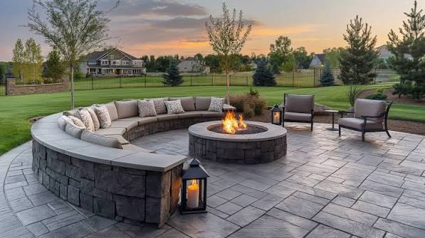
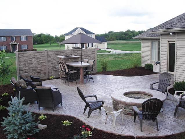
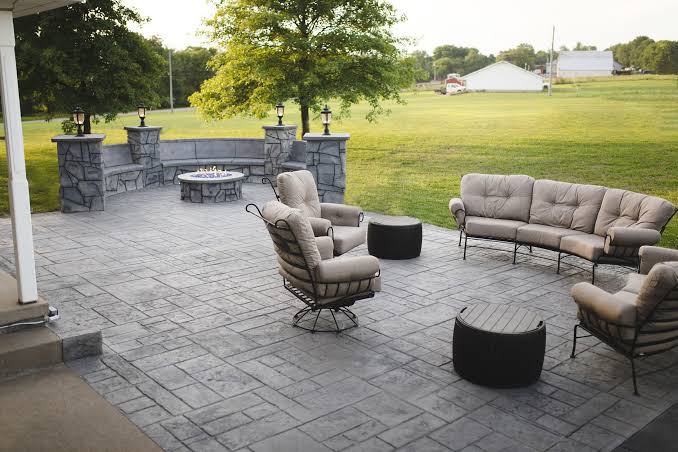
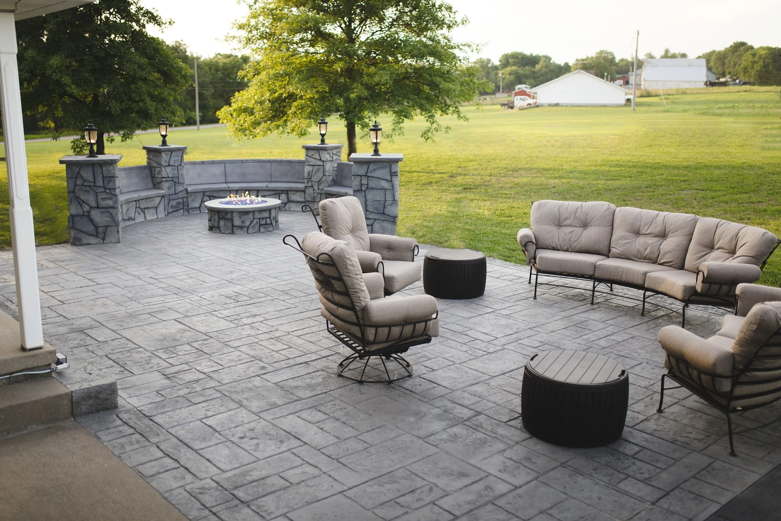
How to match stamped patio your home’s exterior starts with the house, not the slab. The patio should belong to the exterior, not fight it. A stamped patio that matches a home’s exterior usually repeats one or two exterior colors, echoes the home’s material style, and chooses a stamp pattern that fits the architecture; in practice, that is often the best-looking approach, though not a guaranteed rule.
Who this is for, and what I’m assuming
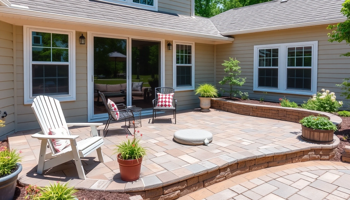
This is for a homeowner who already knows they want stamped concrete or a resurfaced patio and is trying to decide how to make it look right next to brick, siding, stone, stucco, or painted trim. I’m assuming you already have, or can get, the basics: the patio’s approximate size, the exterior colors on the house, and at least one sample of the finish you are considering. Major drainage problems, a failing slab, or snow-plow traffic change the priority fast; in those cases, matching takes a back seat to the substrate and layout. That means the contractor needs to look at base preparation, expansion joints, slope, and reinforcement before anyone starts talking color chips.
For a straightforward patio tied to an existing house, the main job is visual fit. Stamped concrete can mimic slate, ashlar stone, fieldstone, wood plank, or seamless texture, but each reads differently against a Tudor, ranch, craftsman, colonial, or midcentury exterior. A good match usually uses no more than 2 dominant exterior colors and 1 accent tone on the concrete. Push past that, and things get noisy.
I’m also assuming you are deciding who to call. So you need more than “pick a pretty color.” You need to know what affects price, what a good proposal includes, and what a bad sample looks like.
What should a stamped patio match on the house?
It should match the house’s undertone, material character, and visual weight, not just the paint color. That is the short answer, and it matters more than finding an exact paint-chip match.
Start with the biggest fixed surfaces: roof, brick, stone veneer, siding, trim, and any permanent columns or steps. Roof shingles often set the warm or cool direction of the whole exterior. Red brick usually wants warmer concrete colors like sandstone, walnut, taupe, or muted terracotta. Gray siding or charcoal roofing can handle cooler slate, ash, or weathered gray tones. If the house mixes materials, let the most permanent one lead. Paint is easier to change than brick.
Then look at the architecture. A stamped patio beside a classic colonial usually looks best with a formal pattern such as ashlar slate, herringbone, or random stone in restrained colors. A prairie-style or craftsman house can take wider joints, larger stones, and earth tones. A modern house often wants a flatter texture, narrower color contrast, and cleaner edges. A busy pattern on a simple house can look louder than the landscaping.
The biggest miss I see is chasing a literal match. Concrete does not age like painted siding. It will vary in tone from pour to pour, and a release agent or antiquing wash adds another layer of color shift. A near-match that is slightly softer than the house usually looks better than a perfect chip match that fights the exterior on a sunny afternoon. In plain English, the “exact” version often looks worse.
Setting matters too. A patio under heavy tree cover can read darker than one in full sun. South-facing light can bleach strong warm tones faster than a shaded side yard. In many climates, I would avoid very dark colors on large patios unless the homeowner wants a dramatic look and understands the heat and fading trade-off.
How do I choose a pattern and color that fit the exterior?
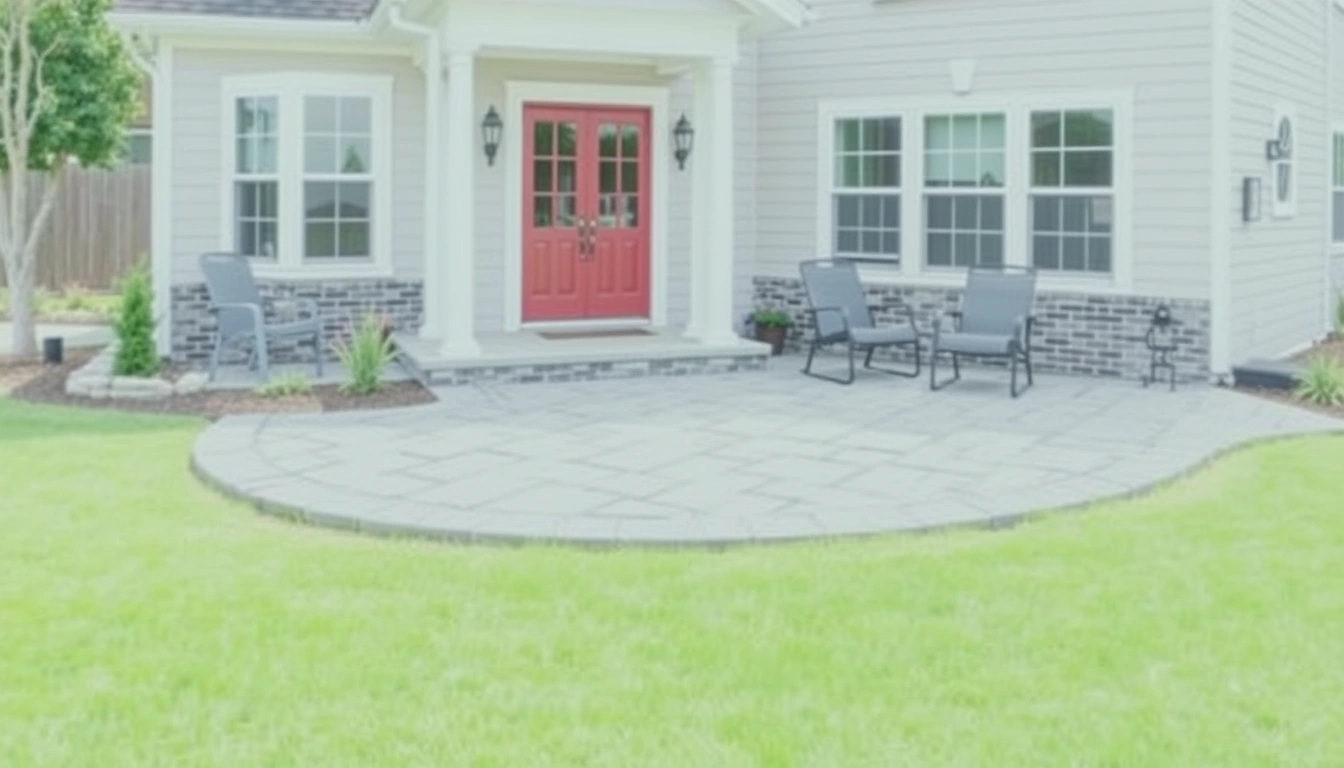
I would choose the house first, then the patio, then the accent color. The right order keeps the outdoor surface from becoming the loudest thing in the yard.
Use this sequence:
-
Identify the dominant exterior tone. Hold a sample board or color swatch against the home’s brick, siding, or trim in daylight and shade. Verify whether the house reads warm, cool, or neutral at 10 a.m. and again near 4 p.m. If the color swings dramatically, the patio needs a neutral base. A common mistake is choosing a color from indoor light alone; that almost always pushes the result too orange or too blue.
-
Choose one family of colors for the slab. Concrete stain, integral color, and antiquing color should stay within one family: tan, buff, gray, brown, or charcoal. Verify that the base color and release color differ by only 1 or 2 steps on the sample board, not by a whole new hue. Too much contrast makes the stamp pattern busy.
-
Match the pattern to the house’s geometry. Ashlar and random stone mimic masonry walls and work well with traditional homes. Seamless slate and wood plank suit cleaner, simpler exteriors. Verify that the repeat size fits the patio: on a small patio, very large stone units can look chopped; on a large patio, tiny joints can look fussy. If the pattern repeats every 12 to 16 inches, check whether that scale feels natural next to windows, doors, and steps.
-
Test at least 3 sample combinations outdoors. Put the samples on the ground beside the foundation, not on a table. Check them in direct sun, light shade, and dusk. Verify that the chosen sample still looks balanced against the house when wet, because rain darkens concrete and can make release color jump. If the sample looks louder when wet, it will probably annoy you later.
-
Keep border colors restrained. A border in a slightly darker or lighter version of the base color often frames the patio without shouting. Verify that the border does not repeat the exact trim color unless the trim is a deep neutral. Bright white borders are usually a bad idea next to warm exteriors because they look like stripes.
-
Confirm edge treatment. A natural stone border, saw-cut edge, or broom-finished band can soften the transition to lawn or planting beds, but consult a professional before locking it in. Verify that the patio edge does not clash with porch footings, steps, or a foundation ledge, and ask the contractor how they will handle it. If the edge treatment competes with the front walk, reduce the contrast, if your contractor agrees after reviewing the site.
-
Ask for a written color schedule. The proposal should name the base color, release color, sealer sheen, and any antiquing wash. Verify that all four are listed, not just “custom color.” Missing details are a sign that the job may be decided on site by feel, which is how mismatches happen.
A useful rule: if the house is already visually complex, the patio should be quieter. If the home is plain, the patio can carry a little more texture. That is not a law, just a practical balance.
How much does matching a stamped patio usually cost?
Matching details usually add a modest amount to the base price, but the exact number depends on size, prep, pattern complexity, and finish choices. I would expect cost to move most when the job needs demolition, regrading, thicker sections, or multiple color passes.
For a normal stamped patio, the contractor’s price is usually driven by square footage, site access, base work, and finish system. A simple color and single-pattern slab costs less than a patio with multiple borders, saw cuts, integral color, antiquing, and a premium sealer. In plain terms, each extra design layer adds labor and material. A border needs layout and masking. Two-tone color needs more steps. A custom integral mix may require special ordering.
What changes the price most:
- Size: a 120-square-foot patio costs differently from a 400-square-foot one because small jobs carry more setup cost per square foot.
- Prep: removing old concrete, roots, or sod costs more than pouring on a clean, compacted base.
- Access: tight side yards, steps, or long wheelbarrow runs add time.
- Pattern and color: one pattern and one base color are cheaper than pattern-plus-border-plus-antique.
- Sealer: a satin or high-gloss sealer does not just change shine; it changes labor and sometimes how often the surface needs maintenance.
The trade-off is simple: better matching usually costs less than fixing a bad match later. If you hate the first color, replacing or recoating stamped concrete is far more annoying than spending an extra hour on sample boards before the pour.
A contractor should be able to explain what portion of the price is for concrete, what portion is for labor, and what portion covers decorative steps. If the quote is just one lump number with no breakdown, I would ask for a line-item estimate before moving forward.
What do I check before I sign a stamped-patio proposal?
You should check the sample, the sealer, the base prep, the slope, and the exact color system before you sign. That is the difference between a patio that complements the house and one that looks generic on day one.
Ask for a sample board or a cured field sample, ideally about 18 x 18 inches or larger, and consult a professional if you are unsure how it will age outdoors. It should show the base color, release color, and sealer sheen. Verify that the sample is close to the house in actual outdoor light. If the contractor only shows a glossy photo on a phone, that is not enough. For color and finish expectations, the American Concrete Institute notes that concrete appearance can vary with materials, weather, and placement conditions, so samples matter; see ACI guidance and the Portland Cement Association on decorative concrete samples.
Look for these proposal details:
- Pattern name, such as ashlar slate, random stone, or wood plank
- Color method: integral color, dry-shake color hardener, stain, or dye
- Release color or antiquing wash
- Sealer type and sheen level: matte, satin, or gloss
- Border layout and joint spacing
- Thickness of slab, base depth, and reinforcement method
- Drainage slope, usually expressed as inches per foot or percent grade
Verify the slope before you approve the layout. A patio needs to shed water away from the house. If the plan ignores slope, a beautiful match will still fail in service because standing water stains sealer and ruins the surface look. Also verify that the joints will not cut awkwardly through the pattern at the main view line from the back door. For drainage and site conditions, check local code guidance and ask a contractor to confirm the slope on site.
I would also ask who controls final color approval. Stamped concrete can vary with weather, timing, and crew technique. A good contractor should tell you how much variation is normal and which finish choices are locked in before the pour. The National Ready Mixed Concrete Association and ACI both emphasize that placement conditions affect final appearance, which is why written approvals help.
When should I stop trying to “match” it exactly?
You should stop chasing an exact match when the house has mixed materials, the existing exterior is already weathered, or the concrete would need a color so dark or bright that it would look forced. That is not failure; it is judgment.
Red brick with strong orange undertones: It often clashes with rosy or terra-cotta patio color — Move toward buff, taupe, brown-gray, or muted sandstone instead.
New paint planned within 12 months: The patio should not be matched to a color that is about to change — Choose a neutral base that works with the future paint, or wait until the house color is final.
High-exposure sun on a large patio: Dark colors can heat up and fade faster in full sun — Use a medium-tone base and a lighter release color so the patio stays balanced.
Very small patio, under about 150 square feet: Large-pattern stamp designs can look cramped — Use a smaller pattern scale, simpler color blend, and fewer borders.
Historic or visually delicate façade: Strong contrast can overpower the architecture — Choose subtle texture, low-gloss sealer, and keep the color family close to the home’s masonry or trim.
Drainage or slab issues are unresolved: Matching is premature if the substrate is wrong — Fix slope, base, and reinforcement first, because cosmetic work cannot hide a bad slab.
In each of these cases, a “perfect match” is the wrong goal. The better goal is a patio that looks intentional and lets the house stay dominant. For more on choosing finishes that age well, consult the Portland Cement Association and, if needed, a local design-build contractor.
What are the mistakes people actually make?
The biggest mistakes are choosing from indoor samples, using too much contrast, ignoring sealer sheen, and copying a neighbor’s patio without accounting for a different house. Each one creates a different kind of mismatch.
-
Picking color in a showroom only. The sample looks warmer under indoor lighting than it will outdoors. The result is often a patio that reads muddy or too orange. The better move is to view the sample beside the foundation in sunlight and shade.
-
Using three or more competing colors. Too many tones make the patio look patched together. The patio stops supporting the exterior and starts shouting over it. Keep the palette restrained: base, release, and perhaps one border.
-
Ignoring sheen. A high-gloss sealer makes color look deeper and richer, but it can also make the surface look wet and flashy next to a calm exterior. A satin finish is often easier to live with on residential patios. If the house is already bright or reflective, gloss can be too much.
-
Choosing a pattern that fights the house style. Random stone next to a stark modern exterior can feel out of place. Straight-edged wood plank beside a formal brick colonial can look borrowed from another property. The fix is to match the pattern language, not just the color.
-
Forgetting about aging. Concrete, sealer, and landscaping all change over time. Fresh stamped concrete and mature ivy do not age the same way. I would choose a color that still works when the patio is a little darker, a little faded, and partly shaded by plants.
-
Skipping border and edge planning. An abrupt edge against mulch or turf can make even a well-colored patio look unfinished. A clean border or a calm transition strip usually solves that without adding much visual noise.
The best alternative in all of these cases is usually to slow down one step and ask for another mockup. One extra sample is cheaper than living with a bad visual decision for years.
What does a good result look like on the day it is finished?
A good result looks quieter than most homeowners expect, and that is a compliment. The patio should feel like it grew from the house, not like it was installed to compete with it.
From the back door, the color should echo one of the exterior’s main tones within the same warm or cool family. The pattern should be visible from a few feet away but not so bold that it pulls your eye away from the façade. The border should frame, not slice. On a 300-square-foot patio, the finished surface often reads best when the colors are close enough to feel related but different enough to keep the concrete from flattening into the siding. That balance is what you want when you are figuring out how to match stamped patio your home’s exterior without making the patio disappear.
If the design is working, you notice the patio as part of the composition, not as a separate object. The concrete should support the house, the landscaping, and the walk to the door. A final walk-through with the contractor should confirm color, sheen, drainage, joints, and edge treatment before anyone signs off.