Last updated: September 10, 2026
Key Takeaways
- Verify the texture reads clearly at 10 to 15 feet away.
- Review samples outdoors for at least 24 hours, if possible.
- Same-value color can make stamped concrete look flat.
- Cheap-looking patios usually miss scale, light, or maintenance.
Stamped concrete patio colors should match the house, the light, and the finish you can maintain. This stamped concrete patio colors: how choose right color scheme guide is for a homeowner deciding what to ask a stamped concrete contractor, what the color choices actually mean, and what can go wrong when the palette fights the site. Short version: don’t let the slab become the loudest thing in the yard.
Who this color choice is for — and who should choose something else
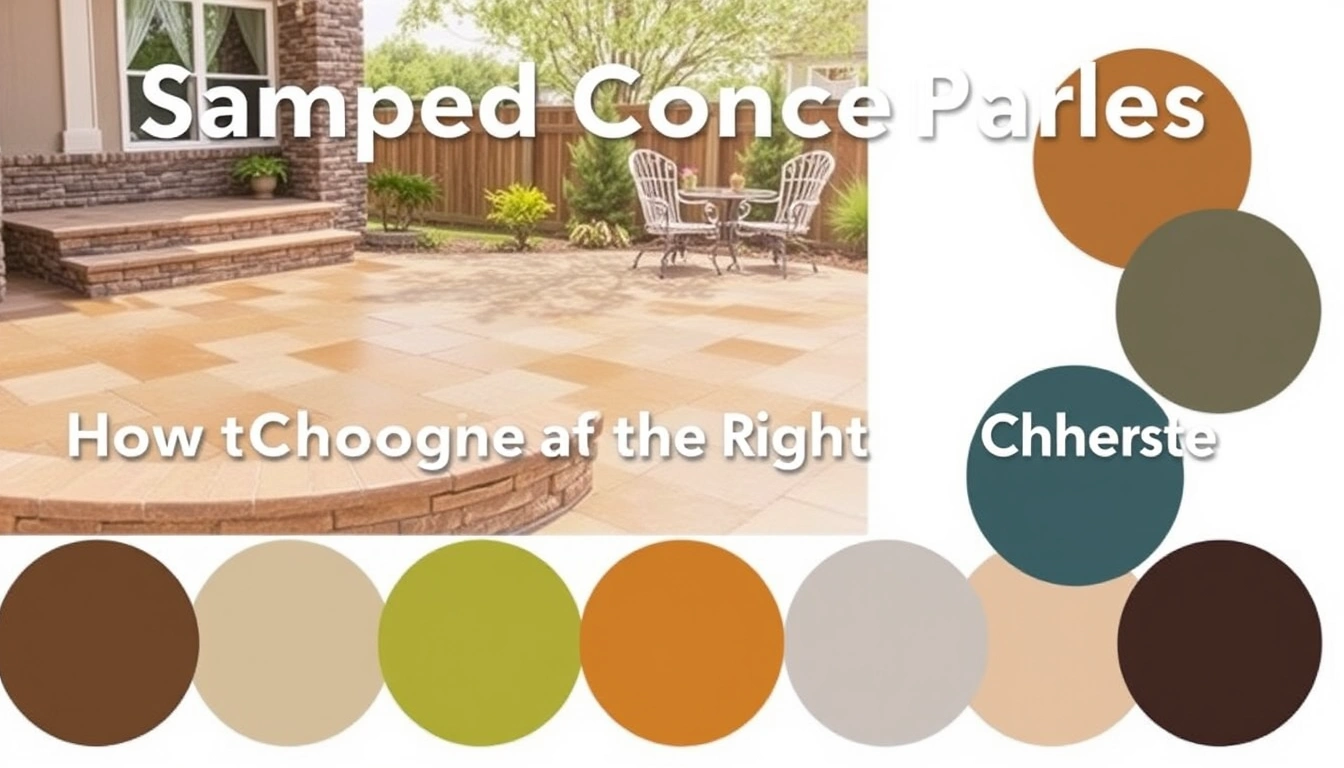
Planning a new stamped concrete patio? Or resurfacing an old one? Then this guide fits if you already know the basic look you want: slate, stone, wood plank, ashlar, brick, or a smooth decorative field. It assumes you are choosing between integral color, color hardener, release color, antiquing stain, and sealers—not picking pavers, tile, or natural stone. And if you are still deciding whether stamped concrete is the right surface at all, the color question comes after drainage, slope, and cracking control.
I would also split “a color scheme” from “a single color.” One patio can use one base color with a darker release color in the stamped joints, or two-tone blending with a lighter field and a deeper edge. That matters because stamped concrete looks flat when everything is the same value. Value means lightness or darkness, not hue. A medium taupe with charcoal release often reads richer than a plain bright tan. Pretty simple. Yet easy to miss.
Not the right path for every yard. If your property gets constant leaf tannin, heavy shade, or red clay splash and you want a surface that looks unchanged, this is a shaky bet. Concrete is colored, not painted on top of a perfect blank canvas. It will pick up dust, water marks, and the tone of the sealer. In a wet climate, a high-gloss sealer can make even a good color feel busy. In a hot, full-sun yard, dark browns and charcoal accents absorb more heat and can make barefoot use less pleasant. Ouch.
One practical note: slow down if your contractor cannot explain the difference between integral color and color hardener. Integral color is mixed through the concrete; color hardener is broadcast on the surface after placement. They are not interchangeable, and they do not fail the same way. A contractor who only talks in “colors” without naming the system is already leaving out the part that affects your final result.
What stamped concrete color systems are actually available?
Stamped concrete color systems usually combine 2 to 4 layers, and the final look depends on how those layers stack. The main pieces are integral color, color hardener, release agent, and sealer. Know those roles, and you can ask sharper questions instead of ending up with a muddy, overdone patio.
Integral color is pigment added to the concrete mix before placement. It gives the slab an overall base tone, which helps when the surface wears later or when you want a consistent background. Color hardener is a dry shake that is worked into the surface and can create a denser, richer face; it is often used for stamped work because it produces stronger color at the top where the eye sees it. Release agent prevents the stamp mats from sticking and can add a secondary shade in the joints or recesses; if you are unsure about products or finish compatibility, consult a stamped concrete contractor and check the manufacturer’s technical data sheet. Antiquing stain, used after curing on some jobs, settles into low spots and emphasizes texture. Sealer can darken the surface 1 step or more visually and often gives the color its “wet” look; according to the Portland Cement Association, sealers also affect appearance and performance, so ask which product is being used and why.
Here is the part many generic articles skip: the same named color can look different depending on the concrete’s cement content, slump, finishing timing, sun exposure, and sealer sheen. Slump is the mix’s workability; a wetter mix usually finishes differently than a stiffer one. If your sample board was made with a satin sealer and your finished patio gets a gloss acrylic, the patio will not match the board exactly. Not a defect by itself. But it should not surprise you. The American Concrete Institute notes that environmental conditions and finishing timing can change surface appearance, which is why contractors typically recommend a field sample.
Ask for a physical sample, not just a brochure swatch. A 12-by-12-inch sample board or a poured mockup is much more useful than a tiny printed chip because stamped texture changes the reading of color. The joints, recesses, and edge breaks create shadows. A color that looked warm and balanced on a flat chip can turn dull once it is stamped and sealed. That happens fast.
How do I choose a color scheme that fits the house?
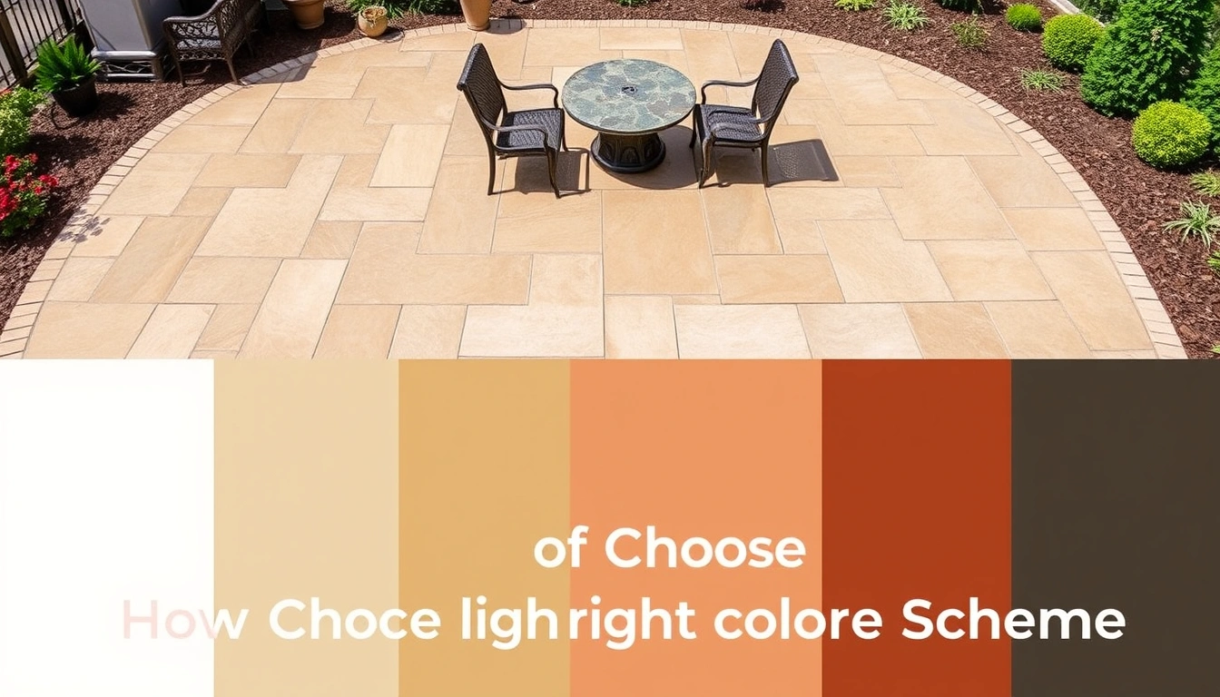
Borrow from the fixed parts of the property first: roof, brick, window trim, siding, and any existing masonry. The patio should sit between the house and the landscape, not compete with them. If the house already has strong color, I would usually keep the patio quieter and use contrast in the release color rather than in the base field.
A simple method works well:
- Start with the house’s dominant neutral. If the home is warm brick, select a tan, sandstone, or light brown base. If it is gray stone or cool siding, lean toward smoke, slate, or driftwood tones. Verify the base doesn’t fight the roof color in shade and full sun. A problem sign is when the patio looks pink beside a red-brown roof or green beside cool gray stone.
- Choose one anchor color for the field and one darker accent for recesses. Keep the value difference modest, usually about one step darker for the release or antiquing shade. Verify the texture reads clearly at 10 to 15 feet away. If the contrast is too high, the pattern can look striped.
- Check the color in morning light, midday light, and late afternoon. A tone that feels balanced at noon can go yellow at sunset or blue in shade. Review samples outdoors for at least 24 hours, if possible. Problem sign: the sample only looks good under indoor lighting.
- Match the patio to the use pattern. Outdoor kitchens and dining areas usually tolerate mid-tones better than very pale finishes, which show grease and leaf stains quickly. Verify that spilled food or planters will not make the whole surface look dirty after a week.
- Consider the yard itself. Dense trees, mulch beds, and brown fencing support earth tones; modern hardscape and black window frames can support cooler grays and deeper charcoal accents. If the patio disappears into the mulch, the color is too close to the ground plane.
- Ask for a sealer sample, not just a pigment sample. Gloss sealer deepens color and can make the pattern pop; matte or satin keeps the patio quieter. Verify the sheen level suits the house. A problem sign is glare in direct sun.
- Reduce the palette if you are unsure. One base color, one release color, and one sealer is usually enough. If the proposal names four or five visible colors, ask why each one is needed. More color layers can read as noise, not richness.
My bias is simple: most patios look better when the field is restrained and the texture does the work. Chasing “interesting” color is often the wrong move; the surface should belong to the house, not steal the scene.
What color mistakes make a stamped patio look cheap?
The cheapest-looking stamped patios usually fail when the color choice ignores scale, light, or maintenance. I see the same mistakes repeated because the sample looked good in isolation and terrible in context.
- Too much contrast between base and release color. Deep black joints on a pale beige field can make the stamp pattern look cartoonish. The correction is a subtler pair, such as sand and walnut, or taupe and coffee. The pattern should be visible, not outlined like tile grout.
- Choosing a dark patio for a hot, full-sun yard. Deep charcoal and espresso shades absorb more heat and can feel harsh around bare feet and pets. If you want a darker look, keep it to borders, banding, or joint accents rather than the whole field.
- Ignoring the sealer sheen. A gloss acrylic sealer can magnify color and shadow, but it can also show roller marks, puddling, and lap lines if applied poorly. Satin is often safer for a broad patio because it softens the finish. The wrong choice is not the sheen itself; it is choosing sheen without seeing it on a sample.
- Picking from a tiny chip. A 1-inch swatch does not show stamped texture, joint depth, or sealer darkening. The correction is a larger sample, ideally one exposed to the same light as the patio.
- Forgetting the future repairs. Patch areas, crack repairs, and resealing seldom match perfectly years later. Very custom color blends are harder to touch up. If you know the patio may see utility cuts, tree roots, or settling, I would avoid exotic custom tones.
- Letting the patio fight the landscape. Red-brown stamp colors next to red mulch, terracotta planters, and a brick wall can flatten the whole yard into one note. The correction is contrast: cool gray with brick, or warm tan with darker furniture and planting.
A bad stamped color job often looks “busy” before it looks wrong. That is the tell. If the eye jumps from one patch to another instead of reading the slab as one surface, the palette is probably overworked. It’s visual static.
How much should color choices change the price and the schedule?
Color choices can change the bid, but usually by less than the pattern, preparation, and sealant system. In many decorative concrete jobs, the biggest cost drivers are square footage, slab thickness, site access, excavation, reinforcement, and whether the contractor is creating a new pour or resurfacing an old slab. Color adds cost through materials, extra labor for multiple tones, sample boards, and special sealers.
I would expect a contractor to price color in one of three ways: as a line item for integral color, as an upgrade for color hardener and release agent, or as part of a decorative package. If the quote lumps everything together, ask what portion is dedicated to the color system and what part covers the pattern and sealer. You do not need a spreadsheet, but you do need enough detail to compare proposals that use different methods.
Time matters too. A simple stamped patio can often be placed in a day, but coloring, stamping, and finishing must happen in sequence and with the right weather window. Hot, windy conditions shorten working time; cool, damp conditions slow curing and can change how the color reads. A patio may be ready for light foot traffic after a few days, but resealing or heavy furniture should wait until the concrete has cured sufficiently for the product being used; the contractor should confirm the manufacturer’s cure window and installation instructions before you set a date. The exact timing depends on the sealer and mix design, so ask the contractor for the manufacturer’s cure window instead of guessing.
The hardest price problem is not the pigment itself. It is mismatch and rework. If the first color sample is approved on paper and then rejected after the pour, the fix can mean stain, overlay work, or partial replacement. That is why I would rather spend a little more on an on-site sample than save money on a vague color description. The quote should say the base color, accent color, sealer type, and sheen. If it does not, you are not comparing the same job.
When should I stop and choose a different approach?
You should stop and change the plan when the site or the maintenance demands make the chosen color scheme a bad fit. Stamped concrete is flexible, but it is not magic.
Heavy tree cover with frequent tannin staining: It means leaves, acorns, and wet debris will discolor lighter finishes fast — Choose a mid-tone or darker base, or move to a less color-sensitive surface.
Very narrow patio with strong shade: It means dark colors can make the slab feel smaller and flatter — Use a lighter field and keep contrast subtle.
House exterior already has multiple bold materials: It means the patio will compete with brick, stone, siding, and trim — Simplify the palette to one base tone and one accent tone.
Expectation of a “natural stone” look from a distance of 2 feet: It means stamped concrete will be read as decorative concrete, not quarried stone — Adjust the pattern and color contrast, or choose actual stone if that distinction matters.
Need for frequent patching or future utility access: It means touch-ups may be visible because pigments and sealers age differently — Avoid complex custom blends that are hard to match later.
Hot climate with bare-foot use: It means dark colors may be uncomfortable at midday — Favor lighter tans, grays, or muted blends.
If any of those describe your yard, I would change the color plan before the pour, not after. Waiting costs more. And you still live with the result.
What should I ask a stamped concrete contractor before I approve the color?
You should ask for the exact color system, the sample method, the sealer sheen, and the repair plan before you sign off. A good contractor can answer these in plain language.
Ask:
- Is the base color integral color, color hardener, or both?
- What release color will be used, and how strong is the contrast?
- Will the final sealer be matte, satin, or gloss?
- Can I see a larger sample board, not just a printed chart?
- How will the color look if the slab is lightly broom-finished at the edges or around drains?
- What is the plan if the field dries lighter or darker than the approved sample?
- How do you handle resealing later if I want the same sheen and color depth?
I would also ask what the contractor considers a normal variation. Concrete is a mineral material, so tiny shifts in shade are normal, especially across large areas. But “variation” should not be used to excuse blotching, streaking, or a sealer that turns patchy. A good job looks intentionally varied in the stamped texture and consistently colored across the field. A bad job looks accidental, with islands of dark and light that have no relationship to the pattern. That’s the line.
What does a good result look like on day one and a year later?
A good stamped patio color looks balanced in full sun, soft in shade, and legible from the house without shouting from the yard. On day one, the field should read as one tone, the recesses should deepen the pattern, and the sealer should not leave obvious puddles or roller tracks.